Create your own custom dashboards
Contents
Getting started with Datonis BI
The tool can be accessed by logging into the following link: https://bi.datonis.io/
The same Datonis MInt credentials can be used to log into the tool. If you have already logged into Datonis MInt, the tool will automatically load by visiting the above-mentioned link.
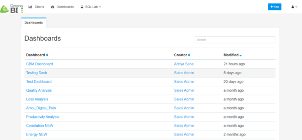
A page showing Dashboards will come up. These are all the dashboards that are already created on this account.
Note – The account used in this manual is our sales demo account which already has some dashboards created. If you are a new user, the list will be blank.
Basic Concepts
<Here you will talk about the concepts of dashboards and slices>
There are 2 items to remember while creating a Dashboard in Datonis BI:
- Charts – A chart is a visualization element (e.g. Bar chart, pivot table, pie chart, filter box).
- Dashboards – Dashboard is a collection of one or many charts which together give Business Meaning.
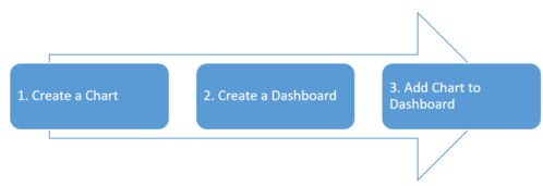
The workflow to create a dashboard is as follows:
Creating a Chart
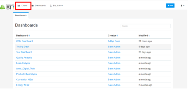
Click on the Charts Tab at the top left of the screen.
Like the Dashboard page, a page showing the list of charts is shown.
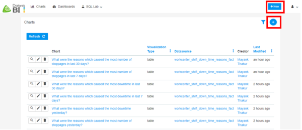
To create a new chart, click on the (+) sign on the top right or Click on +New button on the page and select Chart.
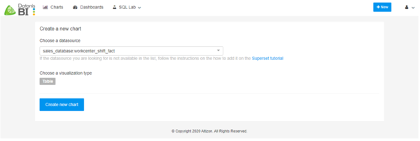
A new page showing the chart configuration will be shown. The next step is to choose the data source and visualization type.
In the ‘Choose a datasource’ drop down, the user will be able to see all the datasources available to him in his account.
In the ‘visualization type’ the user can select a chart from a vast variety of chart types.
Chart Types
Altizon BI has a rich set of data visualization components. Some of them are explained below.
- Line Chart - A line chart displays information as a series of data points connected by a line. This chart can be used to plot a quantity that varies over a time range. E.g. The trend of energy consumption over a period of a week.
- Dual Line Chart - A dual-axis line chart uses two axes to display the relationship of two differently scaled components. E.g. The trend of Production and Rejection quantity.
- Table - A table lets you select the data from a set of components and displays in a tabular form.
- Pivot Table - A pivot table allows you to summarize your data easily. This chart helps you to answer your questions with minimal effort.
- Bar Chart - A bar/ column chart displays categorical information with vertical bars showing the value of the categorical component.
- Time Series Bar Chart - Similar to a bar chart, this displays categorical information with it's value over a time range.
- Pie Chart - A pie chart is used to show relative sizes of data.
- Histogram - A histogram shows the shape and spread of the data being visualized.
- Treemap- A treemap shows categorical component magnitude as a color difference. E.g. Part Cycle Time Ratio - The values <=1 show a GREEN color while the values >1 show RED; meaning that the Cycle Times falling in RED are taking more time the standard cycle times.
- Big Number - This chart just shows a component value. E.g. to monitor the total number of alerts generated for the selected duration.
- Box Plot - The box plot shows the distribution of data using 5 metrics ( min, first quartile, median, third quartile, and max).
- Bubble Chart - Bubble/ Scatter chart plots a series of data points to see if there is any correlation between 2 components.
- and others..
Here is an example of how you can create a chart. An example video is shown below.
ADD VIDEO HERE
The below shows an in-depth way to create a chart.
Clicking on the ‘Table’ button (default set to Table) will pop up a screen showing all the supported visualizations. The user will have to select one and then click on ‘Create New Chart’.
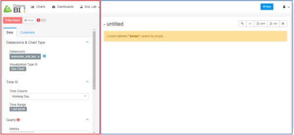
A new page with two sections will open. The section on the left is the Chart type configuration and the section on the right is the chart data rendering section (marked in Red and Blue respectively).
The left section is used to configure the settings like Time column, Metrics, Series etc. which are dependent on the visualization type the user chooses.
The example shown in this case is for a Bar Chart. The bar chart will have a Categorical variable on the X- axis and a Numeric variable on the Y-axis.
On top of the left section, there are 2 tabs:
1. Data - This tab contains the configuration related to the data being viewed in the chart.
2. Customize – This tab contains the look and feel settings for the selected visualization type.
Some of the features are explained in the example below.
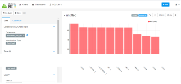
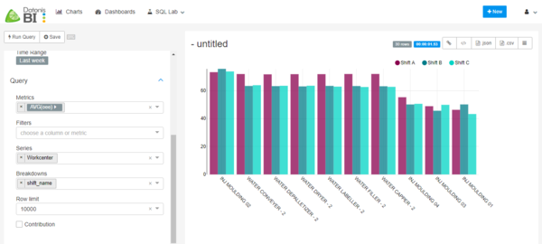
1. Let us say we want to create a chart showing average OEE by Workcenters.
In this case the configurations will be Metrics: OEE, Series: Workcenter
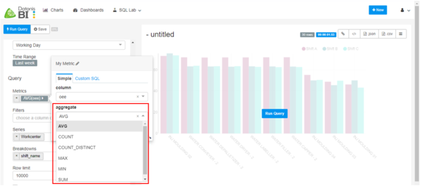
Note – In metrics, you will need to provide an aggregation function amongst the list already provided. Check below image for more details.
When you select the configuration, click on Run Query button on the top left for the chart to render in the right section.
2. Let us say you want to segregate the average OEE by Shift to identify which Shift contributed to what OEE percent? Also, we need bar values and stacked bars.
In this case the configurations will be Metrics: OEE, Series: Workcenter, Breakdowns: Shift Name
When you select the configuration, click on Run Query button on the top left for the chart to render in the right section.
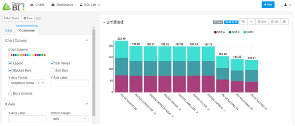
This completes requirement 1 of Avg OEE by Workcenter and Shift. Requirement 2 is more of a look and feel change which can be done using the Customize tab.
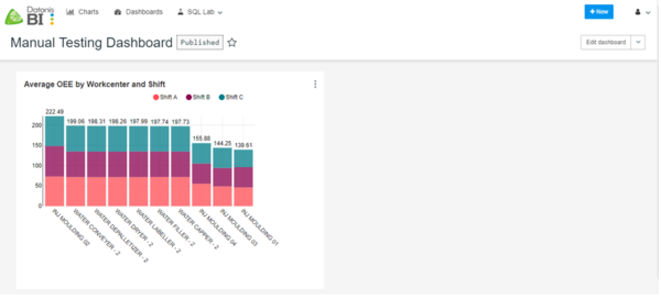
In customize tab, we need to tick options Bar Values and Stacked Bars. The final output looks like this.
Note - Each visualization type will have different Data and Customize selections.
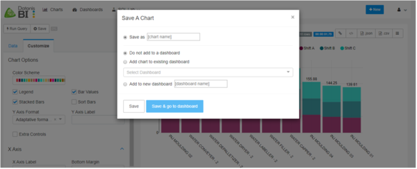
Once you are satisfied with the chart and its look and feel, the chart needs to be saved by clicking on the Save button on the top left side of the screen.
Once you click on the Save button, a popup will be shown. The chart needs to be given a name by which it will be visible on the Dashboard.
There are 2 ways to add a Chart to a Dashboard.
1. Directly from the Save menu saying, ‘Add chart to existing dashboard’ or ‘Add to new dashboard.’
2. Create a dashboard from the Dashboards page, open the dashboard and then add a Chart to it.
Once you save the dashboard, it will be visible as a row in the Charts page list.
If you select Add to new Dashboard, a Dashboard will also be created, and this chart will be added in the Dashboard.
Creating a Dashboard
Here is an example of how you can create a dashboard. An example video is shown below.
ADD VIDEO HERE
The below shows an in-depth way to create a dashboard.
Click on the Dashboards Tab at the top left of the screen.
To create a new dashboard, click on the (+) sign on the top right or Click on +New' but'ton on the page and select Chart.
A configuration page will open, in this the user has to enter the Title, Owners (if multiple people need to edit the dashboard) and Published checkbox to be ticked (if all users having access to the same data source can view the dashboard) and then click on Save.
The dashboard will be visible as a row in the Dashboards page list.
Click on the Dashboard name to access the dashboard.
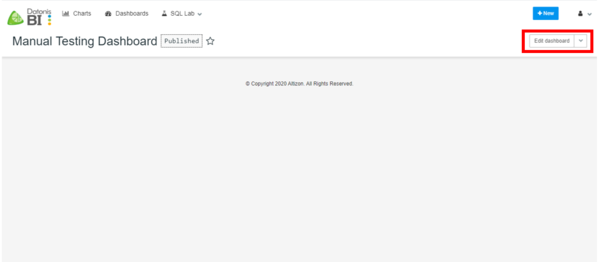
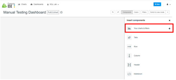
You can see that a blank dashboard has been created. Now we need to add our created chart into this Dashboard. To do this, click on ‘Edit dashboard’ button on the top right of the screen.
This will open an Insert Components tab in which you need to select Your charts and filters.
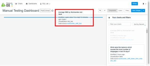
This will list all the charts that have been created using this account.
Select the chart we created and drag it to the blank screen.
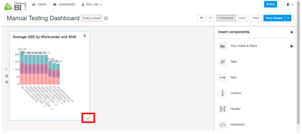
This will add the chart to the dashboard. You can resize the chart by using the arrow at the bottom right of the chart.
Once you are satisfied with the layout, click on ‘Save changes’ and the dashboard will be ready.
Adding a Filter
A filter is a chart type that is used to filter the data based on user selection. E.g. Shift Filter, Workcenter Filter, Part Filter, etc.
Similar to any other chart, the chart to use here is 'Filter Box'. Other steps to add it to the dashboard are the same as mentioned in the 'Creating a Chart' section.
Here is an example of how you can create a filter. An example video is shown below.
ADD VIDEO HERE
Publishing a Dashboard
Once you create a dashboard, for other users to view the dashboard it needs to be published. To do that, go to the Dashboard tab and click on the 'Edit Record' button on the actions tab. Scroll down to the selection of 'Published'. Tick the Published checkbox and Save your changes.
Here is an example of how you can publish a Dashboard. An example video is shown below.
ADD VIDEO HERE
Customising the look and feel
For all of the chart types as mentioned above, there is a 'Customize Tab' in each of the charts. This tab is used to customize the look and feel of the chart.
Some of the customizations include:
- Changing the color scheme
- Sorting the data
- Changing the X/Y Axis labels
- Changing the X/Y Axis Data Formats
Here is an example of how you can customize the look and feel of a chart. An example video is shown below.
ADD VIDEO HERE
